It's hard to add something new after Zoltan's review ahaha But just two and maybe not super important things.
1) You start level 2 by killing the tree to make a path and the prisoner gives you a tip right after you made it. I'm not an expert, but the phrase @cut the tree@ should be before you figured that out. I know there is no option what to do, in this case maybe better to remove this phrase.
2) Would be nice to add the description to pets, because i can see them in the store, but no idea what do they do as result I'm not sure if i should spend so much money of them.
The same actually with potions, when you are checking the store, there is no description on them. But in this case you at least can check in on your screen next to your level.
3) Need more dodge features as guys said before.
Right now u cant control the fight against melee enemies. If you decrease the attack speed, it would be a time to avoid their attacks. For now you just trying calculate how many potions do you need to pass or how many times you should ruin your run.
Overall, the game is nice. I surely like it! Thank you so much! Waiting for updates and continue.
Right away, in the main menu, adding the arrow mechanics is a very cool idea. However, the arrow itself glitches before every reload.
Basically starting at the default position for a single frame, then repositioning to the position of the bow. Not a big deal, but it's easy to fix, and getting rid of it makes the game look more professional.
1.2. Settings Button Logic
The Settings button works as a toggle, but it's only one way. If there won't be more settings, there is no real need to have them hidden behind this button. In general, if there are only a few settings, it’s better to scatter a few related buttons around the edges of the screen. See the Craftpix GUI asset mockups like the Jungle, the Wooden, the Fantasy, or the Space Shooter.
1.3. Button Feedback and Visual State
Overall, if the button's response is tied to the arrow reaching its target, then it would feel more responsive if the button used an in-between state while that happens, instead of acting like a usual button.
Adding a little red target point until the arrow arrives would communicate to the player to anticipate something unusual, then when the arrow hits, that is the time when the button should animate into the pressed state to match it with the exact moment when the user action is resulting in the expected event.
1.4. Missing Main Menu Audio
The lack of sound effects and music in the main menu felt odd when I finally started the game and the music burst at me.
Sound volume settings directly in the game would be a nice addition in the final game.
2. INGAME UI
2.1 Overwhelming UI at Game Start
Once the game starts, the player is immediately overwhelmed by a huge number of unusable UI elements.
It's good practice to only start showing parts of those when they actually become useful or are used at all in the game.
Later on, I realized that this is basically just a stat block and an inventory combined together. This is definitely not the best way to do it.
2.2. Inventory
The inventory should go at the bottom, either in the middle or to the right. That is the usual place where players look for something like this. And it should only show the items the player already has. Showing empty icons is just wasting space.
Money should go here.
2.3. Damage and HP
Showing the damage is useless. There are no weapons or other ways in the game to change it, and the health of the enemy is not displayed as a number either. So even if the player knows this number, there’s no way to figure out how many hits each enemy will need. And knowing that would be pointless anyway, because there are no health-related tactics in the game — you need to kill everyone, no matter how much damage you do or how much health the enemy has.
The same applies to displaying the player's health as a number, when you already have a health bar over the character. There is no need for it.
If you really want to display all these numbers, they should be at least toggleable, and hidden by default. Or displayed only via tooltip. The player definitely won’t need to see them all the time. Some games even hide the health bar if it’s full, just to make sure the player never has to look at anything that won’t serve as useful information at any given time.
2.4. Level and XP
These are fine here. But to make the experience of leveling up more engaging, little XP numbers flying out of enemies when they die would be a nice improvement.
2.5. Unnecessary Signpost Explanations
The three signposts explaining the basic controls — which is common knowledge for every player who reaches the point to actually start the game — is waaay too much text.
Even those who know right from the beginning how to control the game have to spend some time to scan through these with the assumption that there might be some unusual controls in this game worth explaining in detail.
But since there aren't, this is just noise, which once again impacts the overall experience of the game.
2.6. On-Screen Icon Prompts as a Better Approach
Adding an always-visible overlay of icons that suggest what the player needs to do is a lot better approach.
Especially if you don't frontload the players with the jumping and attacking controls, but show them on screen only when they first need it.
3. STORYTELLING
3.1. Action Platformers Should Show, Not Tell
In general, players don't like to read unless it's the very point of what they expect from the game.
An action platformer is not that genre.
Even the intro dialogue from the elder could be made more impactful as a slideshow or a flashback of demons actually crawling out of the well rather than just writing it down.
3.2. Unhelpful or Redundant Elements
The hell signpost is completely useless — once again, just noise.
If the goal here is to make the player visit the magician, all 8 points of interest up until reaching the magician are practically make no sense, especially the arrow that points to the only direction that the player already followed through the whole game.
Adding extra props to the background is a good idea, but not without meaning and purpose. The story is that the demons crawled out of the well, but the environment sure doesn’t look like it. Once again, show, don’t tell. Add broken fences, burning ruins, anything that shows that something indeed happened here, instead of just filling the whole area with boring signposts.
3.3. Broken Parallax Effect
The parallax background is moving incorrectly.
The middle layer should move in the same direction as the front and with half the speed.
3.4. Streamlining the Intro Sequence
The main takeaway of the intro sequence is that it has to be as short as possible.
You should only keep those parts that are crucial to understand what the player needs to do in the game, because players have a very short attention span and can't wait to start to play instead of just warming up.
4. EARLY GAME FLOW
4.1. Premature Shop Interaction
Asking the players to visit the shop with just enough money to buy the first item when they don't even know what to anticipate yet is an unfair move.
Half a minute in the game already and the first meaningful decision is to buy an extra potion or not while we have no idea how often we'll need to use it.
Skip the shop for now. Only send the players there when they already faced the challenges that can be overcome via these items.
4.2. A Better Starting Point
Instead, I would suggest starting the game in medias res — a few extra slides on the intro slideshow, and then jump into the well, directly.
A little animation of the player falling from the top, landing, then the movement keys showing up on screen, without the enemy even in sight at first.
Then the first enemy, waiting patiently to get attacked, with the attack keys displayed under him — this is the ideal user-friendly flow: non-intrusive, minimalistic, to the point.
5. COMBAT
5.1. Combat Collision Issues and Lack of Impact
Not colliding with the enemy is frustrating.
Trying to hit him while overlapping, flailing aimlessly is painful, and an underwhelming battle mechanic.
Enemies should not only collide, but also be knocked back.
Hits should have a higher cooldown, but way bigger damage to make it more satisfying even on the first level.
If the first battle the player experiences is not fun enough, they will never reach the later stages of the game.
5.2. Weak Combat Animations
Attacking while moving only shows the standing attack animation, which simply doesn't look good enough.
The legs of the character should be animated separately from the upper body.
That way, the player can start or stop moving mid-attack and it will still look fluent enough.
5.3. Directional Control
If mouse is meant to be supported, maybe it would be a good idea to add mouse look.
Relying on just attacking towards the movement direction once again can be frustrating.
Preventing the player to do the simplest tactics properly, like backing away from an attack, then hitting the attacker.
Obviously this won't really work with just keyboard controls, but even in that case, if the attack key is held down, then maybe the player shouldn't change direction.
6. PLATFORMING
6.1. Lack of Jumping Animation and Features
Similarly, there is no jump animation.
The player either stands or walks in the air, which is once again a bummer.
The most successful platformers have a lot of industry-standard mechanics around jumping.
Jump height controlled by how long you press a button, and coyote time are just the two most important ones of those.
6.2. Harsh First Jump
Asking the player to make his first jump over a deathtrap is a bit harsh.
Even the classics weren't so mean.
It's nice to allow the player to experiment with less risky jumps first.
7. ENEMIES
7.1. Enemies Are Too Dumb
It's way too easy to just run past the enemies.
They either need more damage, or some other ways of blocking the player.
Otherwise, they are just pushovers.
Forcing me to kill them even though half of them don't even follow me, just so I can free the villager, doesn't make a lot of sense.
7.2. Flawed XP System
Getting XP for landing hits instead of kills feels odd.
Leveling up before even killing the very first enemy is not just confusing and unsatisfying, but undermines the whole value of a leveling system.
Keeping all XP, items and money after death is just a broken, exploitable system. Without punishment, without slowing down player progress, players will not care at all. And I don’t think you want that.
7.3. Boring Combat Loop
The battle in general is just boring.
Spamming attack until the enemy dies.
Not even moving around, because that would slow down the process.
The fact that the player is forced to die and then come back to farm XP multiple times, and there is no optimal way of playing other than just dying and farming and dying until you are tough enough to win, is just a huge disappointment.
8. SECOND LEVEL
8.1. Hits and Misses
On the second level, the addition of new gameplay elements like the tree and the traps are nice. If you want to be extra friendly, you could teach the controls using them in the village. Just a barricade to break through to reach the village, and a pile of rocks to show how to jump. But it has to be implemented carefully, otherwise the player will crave for the actual action and will be annoyed by the dumbed down tutorial.
The underground area bleeding into the screen was surprising. At first I thought it's a glitch. And since in the end the player teleports anyway and there is only a single vertical movement in the whole game, once again, it’s an issue that could have been easily avoided with more thoughtful map design.
8.2. Unforgiving Traps and Slippery Movement
The fact that the traps insta-kill you, but the player movement is kinda floaty — like sliding on ice in the depth of hell — is not a good point either.
Especially because they kill you if you touch them from the side, which is not even intuitive. Even on level 18, with a 1000 health, when I almost one-hit-kill every enemy, I get insta killed by these nasty traps. That’s just bad design.
8.3. Frustration with Repetition
Checkpoints would be nice too. Especially before the fireball trap. I spent a good 45 minutes always dying at this point, then trying to slide and jump through the first part of the map all over again.
There is a reason why saving or at least checkpoints became common in games like these.
Players easily abandon the game if they need to repeat the same things over and over, especially if they weren't really having fun anyway.
8.4. Misleading Progression and Forced Grinding
Finally, looking at the other comments was the key for me to finally finish the game.
Facing the fact that the only surefire way to beat the so-called platforming part of the game is to buy an invulnerability potion from the infinite amount of money you can grind through repeated dying, then skip through the part like it isn't there, is just a huge misleading design.
If the game is meant to be a platformer, then it should be beatable via actual platforming, instead of just mindless grinding.
9. SUMMARY
Overall, the game has potential. I see what it is meant to be.
The first thing coming to my mind was that it's a side-scroller version of Diablo with platformer elements.
Which is a nice idea, but needs way more refinement.
Diablo is played on a 2D top-down plane, which gives room to a lot of tactical elements even in close combat.
Your game at this point is basically 1D. There is very little utilization of the height.
Dare to use the space! Make it an essential part of the gameplay — this is what will make it interesting.
Look at, for example, Shovel Knight or Rogue Legacy.
Find out what is the main concept of your game, the key element, then build the whole game around it. If you chose it to be a side scroller because that is the right perspective to achieve your goals then be a sidescroller, use the space, figure out unique movement or combat patterns.
Don’t end up being one dimensional.
Unless you really want to. But in that case, accept that this is not a platformer game, and really focus on how to make sideways movement exciting.
And most importantly, don’t give up. You might have failed to nail the things I listed on the first try, but that’s exactly what will help you learn and improve upon in the future.
Good luck! And try to have fun in the meantime! You are making a game after all! ;)
I found a recent reference that I really wanted to share with you, right from the CraftPix jam. It uses the same assets and correctly implements a few points I mentioned above:
1. Single screen intro with iconified controls throwing you right into the action afterwards. It could still be better if the controls would appear during the gameplay too, because I needed to start over to check back on the controls, but still it's a great start.
2. Jumping and attacking animations are combined, so no odd looking standing in air situation. This is most likely done by bone-based animation, which is a bit harder to implement, but it's worth it.
It's a good demo, it takes about 15-25 minutes, the mechanics of the game are comparable to the simplest platformer. Of course, there were also bugs (there are many of them):
1. If you hold down A and D, the character continues to run, but in place. 2. In a close encounter with an opponent (the enemy's texture overlaps), neither the player nor the opponent can deal damage.
3. On the 2nd level, you can see a little bit what is happening on the lower floor, there is also no background on the lower floor, and there is no sign with recommendations for using invisibility potions at the moment with electric balls.
4. FPS drawdown to 15-20 at the 2nd level.
5. Sometimes, when a player dies and is reborn, the language may change (from Russian to English).
6. Also, with low fps at the 2nd level, you have to wait 2-3 seconds for the double jump to work.
Overall, I found this game quite enjoyable! The visuals are very friendly and appealing, and the character animations are smooth, which makes for a pleasant experience. I also really liked the in-game sounds. However, I think it would be great if you could add a sound settings option within the game, as there were times when the volume felt a bit too loud.
Regarding the gameplay, I'm quite excited for future updates! It would be fantastic to see the character get new combat options like a bow or a gun.
However, I do have a few minor suggestions:
Poison Effect Clarity: When the character is poisoned, I'd love to see some additional visual cues, perhaps a subtle health drain effect on the character model or a slight flickering effect on the HP bar, to make the poison status clearer.
Damage Text Effect: Adding text damage effects would make combat much more engaging. Currently, it's hard to accurately gauge enemy health and my current damage output.
Spike Trap Placement: The spike traps could definitely use some rebalancing in terms of their placement. I died over 10 times just trying to navigate these specific traps! 😂
Shop Item Pricing: The pricing of items in the shop feels a bit off. I really wanted to buy more items to enhance my gameplay, but the amount of gold earned is quite low, which was a bit disappointing. I hope to see some adjustments here.
Save Game Feature: I really hope a save game feature will be implemented in the next demo version. It's a bit frustrating to lose progress, especially when trying to experiment with different approaches.
My English isn't good, so some parts might be a bit confusing. Please feel free to comment if you need me to clarify anything! 😄
I think the gameplay loop of the game is fun, having to replay levels and get better at the mechanics to progress but I do think there is some scaling issues.
I wasn't able to buy any of the 'new' items past the potion shop, because they are so expensive in comparison to the amount you earn in the levels (especially because I needed to buy an invulnerability potion to beat the fire part)
I'm not sure of their strength but it might be better to have some less strong pets to incentivize spending money on them. The cheapest pet costs 100 coins, which is many run throughs of the level. Especially for the demo that doesn't save your progress, I'd lower the cost on these. For a full release of a game that saves progress they could go back up in price. Also since the players movement is a bit slidey, areas like the spikes in the area here are too finicky in my opinion. I died so many times by landing and sliding into the spikes as you basically have no room for error, yet your character slides after landing. I think either making the sides of the spikes not do damage, increasing the landing spots or Just making them do large amounts of damage so they aren't a one hit kill would be nice. I don't mind having to run through the level a bunch of times, getting better at the mechanics to beat it, I found that bit quiet fun, I just wish that the deaths didn't feel so punishing.
Also, I found the barrels very hard to find the hitbox for breaking, and honestly thought they might be broken when I first encountered the sign for them (especially since the sign doesn't say how to interact with the barrel.)
My last suggestion is to put a pause menu, and in that pause menu include a volume slider. I like to have music on during a game, but so often on itch.io games I have to mute the tab because the volume is set to 100.
Thank you for playing my game! The game was specifically designed to be challenging, with the possibility of death at any moment. As for the cost of pets, they provide significant assistance in completing the game, which is why they are expensive. After completing the second dungeon, if you break the barrels in the village, you will find 30,000 coins, which will allow you to test all the pets and skins.
When you double jump towards the edge of the map while moving forward, the player remains stuck to the wall, and if you insist, you go under the map and remain permanently stuck. Since I couldn't find a pause button, I had to refresh the page and restart the game. Same problem on all the edges of the other maps and with the enchanted tree that must be destroyed at 2nd level.
Combat
We take no damage if we are in exactly the same position as the enemy. But we can attack and kill him.
Combat Improvements
I find that the enemies have way too many health points, you have to hit them on average 10 times before they die !
During a fight, we spend our time attacking, jumping to dodge, attacking, jumping to dodge, etc etc. Maybe add the ability to parry an attack, or something like that.
And there are too many enemies at the end of the first level ! It's really too difficult for the beginning of a game. So I pulled each enemy one by one towards me and I used the glitch of being in the same position as them to avoid taking damage and kill them, otherwise I don't know how I would have done it.
Add a little camera shake effect when attacking or getting hurt, or something that adds intensity to the fights.
Add a small knockback movement to the player when attacked. Maybe to enemies too.
Other Improvements
Add better animation for double jump.
Add a pause menu.
Make the barrel shake slightly when the player taps it, accompanied by a creaking wood sound effect.
Potion costs are sometimes too high for the small effects they provide. For example 600 coins is a lot for just 5 seconds of invincibility.
In the village area, the wall in the background has a parallax effect that is a bit too high, I think.
Small corrections
Missing spaces on this text.
Conclusion
Very good work for this demo Vladimir, you master many aspects of game creation with Game Maker Studio. However, you will have to improve many aspects concerning the combat, which I find is more frustrating than fun. I unfortunately did not finish level 2 because of the tree glitch that blocked me under the map, but I had also noticed in this level a place where I died without understanding why (the one where there are several platforms that self-destruct and with lots of spikes underneath). Good luck with the creation of your game !
Thank you for your feedback, it's really very valuable to me! I have taken your comments into account and have already corrected something, but I am ready to comment on something. The double jump wasn't ideal, as a separate animation wasn't ready for it yet, and I had to rotate the object itself, which could cause the collision mask to graze the texture of the ground and get stuck in it. I've already fixed that. Yes, we do not take damage if we are in the same coordinate as the player, since the enemy's sword does not touch the player. I think this point can be fixed by adding repelling the player and the enemy when attacking, as you suggested, I will add this in the next update. Regarding the large number of health points of enemies: with each new attempt, the player's LVL increases, and with it the damage increases, so it becomes easier to kill enemies every time. Regarding the cost of the invulnerability elixir: this elixir helps to pass through spikes and fireballs, which is why it is so expensive, as it greatly simplifies the passage of the second level, and if you make its effect longer than 5 seconds, then it will be too easy for the player to pass most of the traps.
fun demo and i only played a couple of mins but i have some fundamental issues with it: 1) enemy health bar should not be on the same line as the player's which obscures it, 2) when jumping to the platform with the potion, you fall thru the left-most tile which is misleading as you cannot land on it as expected. after you do collect the potion, you can now stand on the tile. if this is by design as some sort of "trap" or illusion mechanic, i can understand :), 3) adding arrow keys would be a plus and at least an alternate keyboard key used for attack is better than having to LMB, 4) the text is quite small and hard for some of us to read.
a lot of potential fun so thanks for sharing and my hope you'll continue development :)
tried it again , odd choice of key for attack but ok ...
found it to be too tough at the start , the enemies take too many hits to die and they seem to give you lots of damage so i think some balancing needs doing on that
ok, i've revisited and made it into level 2 and appreciate that you've addressed all but the small text (some of which could be remedied with an outline on the font to help make it more legible). meanwhile, i'll try not to re-hash what's already been said )tho i haven't read it all) but the first set of trap placement on level 2 with the slide-y ground movement (which i DO like but could still be slightly reduced?), i think the hitboxes on the traps should be more-narrow or perhaps NOT instant kill at all at this stage but *health-reducing*, instead, even if somewhat rapidly. i will suggest that you add Checkpoints to remove some of the repetition. ie, i don't want to have to take out the tree every time i return to level 2 which becomes mundane when you realize you can hold attack and simply time jumps to avoid the incoming arrows (and the tree's health bar wasn't obvious and, until i randomly started swinging and realized i needed to chop it down, i thought i'd found a bug that would prevent me from moving forward until then). and i've realized i can skip most of the fighting unless i really want their gold once i've purchased the healing dragon which i DO like a lot. that said, i appreciate that we can approach the game in a couple of ways, either fighting or farming gold for a bit. also, already mentioned, is the suggestion to provide more prompts of what's happening in game. ie, adding an audible *rumble* before the ground beneath us falls away would help us time the challenge. and, there is a nice variety of challenge thus far and plenty of fun to be had in *just* the first 2 levels while the balance still seems a little off. that said, i'll be back as you continue to develop and address more concerns :)
Thank you for your feedback! We will definitely take your comments into account. Regarding the platform with the elixir: you are trying to jump onto it using a double jump, as you press it again before landing on the first platform, so you can't jump far enough. We will fix this issue to make it clearer. We will duplicate the controls on the arrows and duplicate the attack on the key.
← Return to game
Comments
Log in with itch.io to leave a comment.
You've an impressive collection of game assets. What software do you use to paint in? I use MS Paint and Gimp for my games.
Hi! We're an art studio, and our artists work with different tools like Aseprite, Photoshop, and Adobe Illustrator.
It's hard to add something new after Zoltan's review ahaha
But just two and maybe not super important things.
1) You start level 2 by killing the tree to make a path and the prisoner gives you a tip right after you made it. I'm not an expert, but the phrase @cut the tree@ should be before you figured that out. I know there is no option what to do, in this case maybe better to remove this phrase.
2) Would be nice to add the description to pets, because i can see them in the store, but no idea what do they do as result I'm not sure if i should spend so much money of them.
The same actually with potions, when you are checking the store, there is no description on them. But in this case you at least can check in on your screen next to your level.
3) Need more dodge features as guys said before.
Right now u cant control the fight against melee enemies. If you decrease the attack speed, it would be a time to avoid their attacks. For now you just trying calculate how many potions do you need to pass or how many times you should ruin your run.
Overall, the game is nice. I surely like it!
Thank you so much! Waiting for updates and continue.
---MY REVIEW---
1. MAIN MENU
1.1. Arrow Glitch on Reload
Right away, in the main menu, adding the arrow mechanics is a very cool idea. However, the arrow itself glitches before every reload.
Basically starting at the default position for a single frame, then repositioning to the position of the bow. Not a big deal, but it's easy to fix, and getting rid of it makes the game look more professional.
1.2. Settings Button Logic
The Settings button works as a toggle, but it's only one way. If there won't be more settings, there is no real need to have them hidden behind this button. In general, if there are only a few settings, it’s better to scatter a few related buttons around the edges of the screen. See the Craftpix GUI asset mockups like the Jungle, the Wooden, the Fantasy, or the Space Shooter.
1.3. Button Feedback and Visual State
Overall, if the button's response is tied to the arrow reaching its target, then it would feel more responsive if the button used an in-between state while that happens, instead of acting like a usual button.
Adding a little red target point until the arrow arrives would communicate to the player to anticipate something unusual, then when the arrow hits, that is the time when the button should animate into the pressed state to match it with the exact moment when the user action is resulting in the expected event.
1.4. Missing Main Menu Audio
The lack of sound effects and music in the main menu felt odd when I finally started the game and the music burst at me.
Sound volume settings directly in the game would be a nice addition in the final game.
2. INGAME UI
2.1 Overwhelming UI at Game Start
Once the game starts, the player is immediately overwhelmed by a huge number of unusable UI elements.
It's good practice to only start showing parts of those when they actually become useful or are used at all in the game.
Later on, I realized that this is basically just a stat block and an inventory combined together. This is definitely not the best way to do it.
2.2. Inventory
The inventory should go at the bottom, either in the middle or to the right. That is the usual place where players look for something like this. And it should only show the items the player already has. Showing empty icons is just wasting space.
Money should go here.
2.3. Damage and HP
Showing the damage is useless. There are no weapons or other ways in the game to change it, and the health of the enemy is not displayed as a number either. So even if the player knows this number, there’s no way to figure out how many hits each enemy will need. And knowing that would be pointless anyway, because there are no health-related tactics in the game — you need to kill everyone, no matter how much damage you do or how much health the enemy has.
The same applies to displaying the player's health as a number, when you already have a health bar over the character. There is no need for it.
If you really want to display all these numbers, they should be at least toggleable, and hidden by default. Or displayed only via tooltip. The player definitely won’t need to see them all the time. Some games even hide the health bar if it’s full, just to make sure the player never has to look at anything that won’t serve as useful information at any given time.
2.4. Level and XP
These are fine here. But to make the experience of leveling up more engaging, little XP numbers flying out of enemies when they die would be a nice improvement.
2.5. Unnecessary Signpost Explanations
The three signposts explaining the basic controls — which is common knowledge for every player who reaches the point to actually start the game — is waaay too much text.
Even those who know right from the beginning how to control the game have to spend some time to scan through these with the assumption that there might be some unusual controls in this game worth explaining in detail.
But since there aren't, this is just noise, which once again impacts the overall experience of the game.
2.6. On-Screen Icon Prompts as a Better Approach
Adding an always-visible overlay of icons that suggest what the player needs to do is a lot better approach.
Especially if you don't frontload the players with the jumping and attacking controls, but show them on screen only when they first need it.
3. STORYTELLING
3.1. Action Platformers Should Show, Not Tell
In general, players don't like to read unless it's the very point of what they expect from the game.
An action platformer is not that genre.
Even the intro dialogue from the elder could be made more impactful as a slideshow or a flashback of demons actually crawling out of the well rather than just writing it down.
3.2. Unhelpful or Redundant Elements
The hell signpost is completely useless — once again, just noise.
If the goal here is to make the player visit the magician, all 8 points of interest up until reaching the magician are practically make no sense, especially the arrow that points to the only direction that the player already followed through the whole game.
Adding extra props to the background is a good idea, but not without meaning and purpose. The story is that the demons crawled out of the well, but the environment sure doesn’t look like it. Once again, show, don’t tell. Add broken fences, burning ruins, anything that shows that something indeed happened here, instead of just filling the whole area with boring signposts.
3.3. Broken Parallax Effect
The parallax background is moving incorrectly.
The middle layer should move in the same direction as the front and with half the speed.
3.4. Streamlining the Intro Sequence
The main takeaway of the intro sequence is that it has to be as short as possible.
You should only keep those parts that are crucial to understand what the player needs to do in the game, because players have a very short attention span and can't wait to start to play instead of just warming up.
4. EARLY GAME FLOW
4.1. Premature Shop Interaction
Asking the players to visit the shop with just enough money to buy the first item when they don't even know what to anticipate yet is an unfair move.
Half a minute in the game already and the first meaningful decision is to buy an extra potion or not while we have no idea how often we'll need to use it.
Skip the shop for now. Only send the players there when they already faced the challenges that can be overcome via these items.
4.2. A Better Starting Point
Instead, I would suggest starting the game in medias res — a few extra slides on the intro slideshow, and then jump into the well, directly.
A little animation of the player falling from the top, landing, then the movement keys showing up on screen, without the enemy even in sight at first.
Then the first enemy, waiting patiently to get attacked, with the attack keys displayed under him — this is the ideal user-friendly flow: non-intrusive, minimalistic, to the point.
5. COMBAT
5.1. Combat Collision Issues and Lack of Impact
Not colliding with the enemy is frustrating.
Trying to hit him while overlapping, flailing aimlessly is painful, and an underwhelming battle mechanic.
Enemies should not only collide, but also be knocked back.
Hits should have a higher cooldown, but way bigger damage to make it more satisfying even on the first level.
If the first battle the player experiences is not fun enough, they will never reach the later stages of the game.
5.2. Weak Combat Animations
Attacking while moving only shows the standing attack animation, which simply doesn't look good enough.
The legs of the character should be animated separately from the upper body.
That way, the player can start or stop moving mid-attack and it will still look fluent enough.
5.3. Directional Control
If mouse is meant to be supported, maybe it would be a good idea to add mouse look.
Relying on just attacking towards the movement direction once again can be frustrating.
Preventing the player to do the simplest tactics properly, like backing away from an attack, then hitting the attacker.
Obviously this won't really work with just keyboard controls, but even in that case, if the attack key is held down, then maybe the player shouldn't change direction.
6. PLATFORMING
6.1. Lack of Jumping Animation and Features
Similarly, there is no jump animation.
The player either stands or walks in the air, which is once again a bummer.
The most successful platformers have a lot of industry-standard mechanics around jumping.
Jump height controlled by how long you press a button, and coyote time are just the two most important ones of those.
6.2. Harsh First Jump
Asking the player to make his first jump over a deathtrap is a bit harsh.
Even the classics weren't so mean.
It's nice to allow the player to experiment with less risky jumps first.
7. ENEMIES
7.1. Enemies Are Too Dumb
It's way too easy to just run past the enemies.
They either need more damage, or some other ways of blocking the player.
Otherwise, they are just pushovers.
Forcing me to kill them even though half of them don't even follow me, just so I can free the villager, doesn't make a lot of sense.
7.2. Flawed XP System
Getting XP for landing hits instead of kills feels odd.
Leveling up before even killing the very first enemy is not just confusing and unsatisfying, but undermines the whole value of a leveling system.
Keeping all XP, items and money after death is just a broken, exploitable system. Without punishment, without slowing down player progress, players will not care at all. And I don’t think you want that.
7.3. Boring Combat Loop
The battle in general is just boring.
Spamming attack until the enemy dies.
Not even moving around, because that would slow down the process.
The fact that the player is forced to die and then come back to farm XP multiple times, and there is no optimal way of playing other than just dying and farming and dying until you are tough enough to win, is just a huge disappointment.
8. SECOND LEVEL
8.1. Hits and Misses
On the second level, the addition of new gameplay elements like the tree and the traps are nice. If you want to be extra friendly, you could teach the controls using them in the village. Just a barricade to break through to reach the village, and a pile of rocks to show how to jump. But it has to be implemented carefully, otherwise the player will crave for the actual action and will be annoyed by the dumbed down tutorial.
The underground area bleeding into the screen was surprising. At first I thought it's a glitch. And since in the end the player teleports anyway and there is only a single vertical movement in the whole game, once again, it’s an issue that could have been easily avoided with more thoughtful map design.
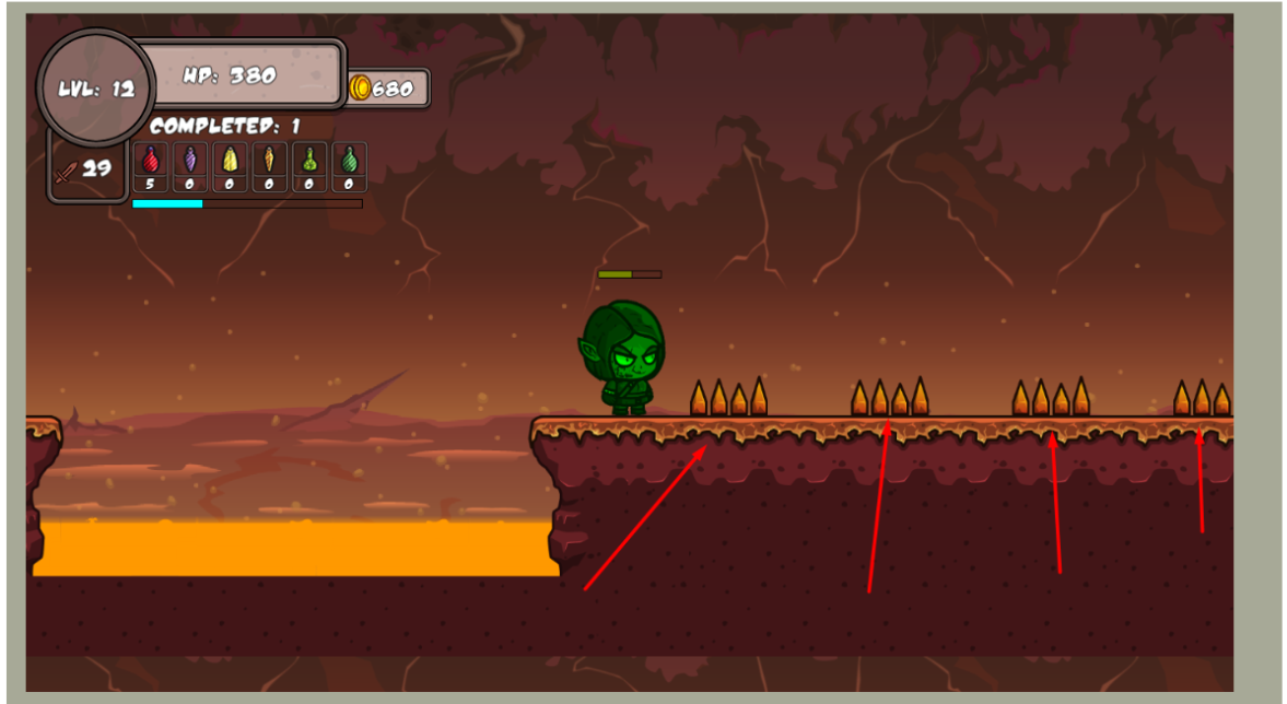
8.2. Unforgiving Traps and Slippery Movement
The fact that the traps insta-kill you, but the player movement is kinda floaty — like sliding on ice in the depth of hell — is not a good point either.
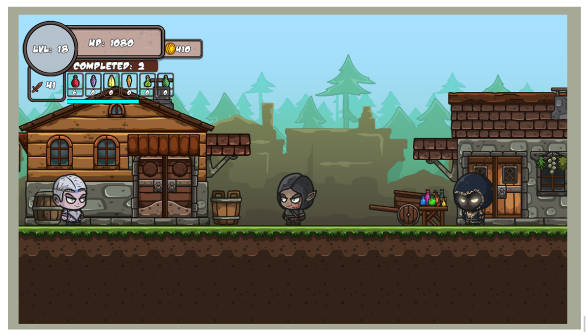
Especially because they kill you if you touch them from the side, which is not even intuitive. Even on level 18, with a 1000 health, when I almost one-hit-kill every enemy, I get insta killed by these nasty traps. That’s just bad design.
8.3. Frustration with Repetition
Checkpoints would be nice too. Especially before the fireball trap. I spent a good 45 minutes always dying at this point, then trying to slide and jump through the first part of the map all over again.
There is a reason why saving or at least checkpoints became common in games like these.
Players easily abandon the game if they need to repeat the same things over and over, especially if they weren't really having fun anyway.
8.4. Misleading Progression and Forced Grinding
Finally, looking at the other comments was the key for me to finally finish the game.
Facing the fact that the only surefire way to beat the so-called platforming part of the game is to buy an invulnerability potion from the infinite amount of money you can grind through repeated dying, then skip through the part like it isn't there, is just a huge misleading design.
If the game is meant to be a platformer, then it should be beatable via actual platforming, instead of just mindless grinding.
9. SUMMARY
Overall, the game has potential. I see what it is meant to be.
The first thing coming to my mind was that it's a side-scroller version of Diablo with platformer elements.
Which is a nice idea, but needs way more refinement.
Diablo is played on a 2D top-down plane, which gives room to a lot of tactical elements even in close combat.
Your game at this point is basically 1D. There is very little utilization of the height.
Dare to use the space! Make it an essential part of the gameplay — this is what will make it interesting.
Look at, for example, Shovel Knight or Rogue Legacy.
Find out what is the main concept of your game, the key element, then build the whole game around it. If you chose it to be a side scroller because that is the right perspective to achieve your goals then be a sidescroller, use the space, figure out unique movement or combat patterns.
Don’t end up being one dimensional.
Unless you really want to. But in that case, accept that this is not a platformer game, and really focus on how to make sideways movement exciting.
And most importantly, don’t give up. You might have failed to nail the things I listed on the first try, but that’s exactly what will help you learn and improve upon in the future.
Good luck! And try to have fun in the meantime! You are making a game after all! ;)
I found a recent reference that I really wanted to share with you, right from the CraftPix jam. It uses the same assets and correctly implements a few points I mentioned above:
1. Single screen intro with iconified controls throwing you right into the action afterwards. It could still be better if the controls would appear during the gameplay too, because I needed to start over to check back on the controls, but still it's a great start.
2. Jumping and attacking animations are combined, so no odd looking standing in air situation. This is most likely done by bone-based animation, which is a bit harder to implement, but it's worth it.
It's a good demo, it takes about 15-25 minutes, the mechanics of the game are comparable to the simplest platformer. Of course, there were also bugs (there are many of them):
1. If you hold down A and D, the character continues to run, but in place. 2. In a close encounter with an opponent (the enemy's texture overlaps), neither the player nor the opponent can deal damage.
3. On the 2nd level, you can see a little bit what is happening on the lower floor, there is also no background on the lower floor, and there is no sign with recommendations for using invisibility potions at the moment with electric balls.
4. FPS drawdown to 15-20 at the 2nd level.
5. Sometimes, when a player dies and is reborn, the language may change (from Russian to English).
6. Also, with low fps at the 2nd level, you have to wait 2-3 seconds for the double jump to work.
Overall, I found this game quite enjoyable! The visuals are very friendly and appealing, and the character animations are smooth, which makes for a pleasant experience. I also really liked the in-game sounds. However, I think it would be great if you could add a sound settings option within the game, as there were times when the volume felt a bit too loud.
Regarding the gameplay, I'm quite excited for future updates! It would be fantastic to see the character get new combat options like a bow or a gun.
However, I do have a few minor suggestions:
Poison Effect Clarity: When the character is poisoned, I'd love to see some additional visual cues, perhaps a subtle health drain effect on the character model or a slight flickering effect on the HP bar, to make the poison status clearer.
Damage Text Effect: Adding text damage effects would make combat much more engaging. Currently, it's hard to accurately gauge enemy health and my current damage output.
Spike Trap Placement: The spike traps could definitely use some rebalancing in terms of their placement. I died over 10 times just trying to navigate these specific traps! 😂
Shop Item Pricing: The pricing of items in the shop feels a bit off. I really wanted to buy more items to enhance my gameplay, but the amount of gold earned is quite low, which was a bit disappointing. I hope to see some adjustments here.
Save Game Feature: I really hope a save game feature will be implemented in the next demo version. It's a bit frustrating to lose progress, especially when trying to experiment with different approaches.
My English isn't good, so some parts might be a bit confusing. Please feel free to comment if you need me to clarify anything! 😄
I think the gameplay loop of the game is fun, having to replay levels and get better at the mechanics to progress but I do think there is some scaling issues.
I wasn't able to buy any of the 'new' items past the potion shop, because they are so expensive in comparison to the amount you earn in the levels (especially because I needed to buy an invulnerability potion to beat the fire part)
I'm not sure of their strength but it might be better to have some less strong pets to incentivize spending money on them. The cheapest pet costs 100 coins, which is many run throughs of the level. Especially for the demo that doesn't save your progress, I'd lower the cost on these. For a full release of a game that saves progress they could go back up in price. Also since the players movement is a bit slidey, areas like the spikes in the area here are too finicky in my opinion. I died so many times by landing and sliding into the spikes as you basically have no room for error, yet your character slides after landing. I think either making the sides of the spikes not do damage, increasing the landing spots or Just making them do large amounts of damage so they aren't a one hit kill would be nice. I don't mind having to run through the level a bunch of times, getting better at the mechanics to beat it, I found that bit quiet fun, I just wish that the deaths didn't feel so punishing.
Also, I found the barrels very hard to find the hitbox for breaking, and honestly thought they might be broken when I first encountered the sign for them (especially since the sign doesn't say how to interact with the barrel.)
My last suggestion is to put a pause menu, and in that pause menu include a volume slider. I like to have music on during a game, but so often on itch.io games I have to mute the tab because the volume is set to 100.
Thank you for playing my game! The game was specifically designed to be challenging, with the possibility of death at any moment. As for the cost of pets, they provide significant assistance in completing the game, which is why they are expensive. After completing the second dungeon, if you break the barrels in the village, you will find 30,000 coins, which will allow you to test all the pets and skins.
Here is my review !
Important bugs
Double jump on the edges of the map
When you double jump towards the edge of the map while moving forward, the player remains stuck to the wall, and if you insist, you go under the map and remain permanently stuck. Since I couldn't find a pause button, I had to refresh the page and restart the game. Same problem on all the edges of the other maps and with the enchanted tree that must be destroyed at 2nd level.
Combat
We take no damage if we are in exactly the same position as the enemy. But we can attack and kill him.
Combat Improvements
Other Improvements
Small corrections
Missing spaces on this text.
Conclusion
Very good work for this demo Vladimir, you master many aspects of game creation with Game Maker Studio. However, you will have to improve many aspects concerning the combat, which I find is more frustrating than fun. I unfortunately did not finish level 2 because of the tree glitch that blocked me under the map, but I had also noticed in this level a place where I died without understanding why (the one where there are several platforms that self-destruct and with lots of spikes underneath). Good luck with the creation of your game !
Thank you for your feedback, it's really very valuable to me! I have taken your comments into account and have already corrected something, but I am ready to comment on something. The double jump wasn't ideal, as a separate animation wasn't ready for it yet, and I had to rotate the object itself, which could cause the collision mask to graze the texture of the ground and get stuck in it. I've already fixed that. Yes, we do not take damage if we are in the same coordinate as the player, since the enemy's sword does not touch the player. I think this point can be fixed by adding repelling the player and the enemy when attacking, as you suggested, I will add this in the next update. Regarding the large number of health points of enemies: with each new attempt, the player's LVL increases, and with it the damage increases, so it becomes easier to kill enemies every time. Regarding the cost of the invulnerability elixir: this elixir helps to pass through spikes and fireballs, which is why it is so expensive, as it greatly simplifies the passage of the second level, and if you make its effect longer than 5 seconds, then it will be too easy for the player to pass most of the traps.
fun demo and i only played a couple of mins but i have some fundamental issues with it: 1) enemy health bar should not be on the same line as the player's which obscures it, 2) when jumping to the platform with the potion, you fall thru the left-most tile which is misleading as you cannot land on it as expected. after you do collect the potion, you can now stand on the tile. if this is by design as some sort of "trap" or illusion mechanic, i can understand :), 3) adding arrow keys would be a plus and at least an alternate keyboard key used for attack is better than having to LMB, 4) the text is quite small and hard for some of us to read.
a lot of potential fun so thanks for sharing and my hope you'll continue development :)
agreed - mouse for attack is especially bad
I changed the attack, test it! Now you can just hold down the attack key instead of pressing it many times
tried it again , odd choice of key for attack but ok ...
found it to be too tough at the start , the enemies take too many hits to die and they seem to give you lots of damage so i think some balancing needs doing on that
ok, i've revisited and made it into level 2 and appreciate that you've addressed all but the small text (some of which could be remedied with an outline on the font to help make it more legible). meanwhile, i'll try not to re-hash what's already been said )tho i haven't read it all) but the first set of trap placement on level 2 with the slide-y ground movement (which i DO like but could still be slightly reduced?), i think the hitboxes on the traps should be more-narrow or perhaps NOT instant kill at all at this stage but *health-reducing*, instead, even if somewhat rapidly. i will suggest that you add Checkpoints to remove some of the repetition. ie, i don't want to have to take out the tree every time i return to level 2 which becomes mundane when you realize you can hold attack and simply time jumps to avoid the incoming arrows (and the tree's health bar wasn't obvious and, until i randomly started swinging and realized i needed to chop it down, i thought i'd found a bug that would prevent me from moving forward until then). and i've realized i can skip most of the fighting unless i really want their gold once i've purchased the healing dragon which i DO like a lot. that said, i appreciate that we can approach the game in a couple of ways, either fighting or farming gold for a bit. also, already mentioned, is the suggestion to provide more prompts of what's happening in game. ie, adding an audible *rumble* before the ground beneath us falls away would help us time the challenge. and, there is a nice variety of challenge thus far and plenty of fun to be had in *just* the first 2 levels while the balance still seems a little off. that said, i'll be back as you continue to develop and address more concerns :)
Thank you for your feedback! We will definitely take your comments into account. Regarding the platform with the elixir: you are trying to jump onto it using a double jump, as you press it again before landing on the first platform, so you can't jump far enough. We will fix this issue to make it clearer. We will duplicate the controls on the arrows and duplicate the attack on the key.